How do Landing Pages Work?
By Daclaud Lee, SEO and Digital Marketing Strategy at Archmore Business Web

What is a Landing Page?
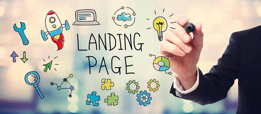
In a nutshell, a Landing Page is a web page that appears (where you "land on") when you click on a link. This link can be an email link, a blog link, a social media link, a link from an ad, a QR code or an organic search link. A landing page can be any page on your website that you intend for visitors to find. Landing pages are an important aspect of every website and is essential for digital marketing and SEO strategy.
Different Types of Landing Pages
For example if you are running an entertainment or news blog, then your landing page is an article. If you are running an e-commerce website, then your landing page will be the product you are selling. A restaurant's landing page can either be the home page or a menu (especially during the Covid pandemic, a lot of restaurants implemented disposable QR codes rather than physical menus so their customers can access their menu on their phones to encourage social distancing), if you have a service area business, then your landing page will be a page designed to sell your service within a specific area that you serve. These are just several examples of landing pages.
What is the Purpose of a Landing Page?
A landing page serves many purposes, although some landing pages really have no purpose and are just there; this is a mistake that you should fix. The main purpose a good landing page is to convert visitors into customers, readers into subscribers and turn leads into sales. The definition of a customer can vary depending on the type of business.
Example 1 - Landing Pages for Blogs and Media Companies
If you are a media company or blogger, then your customer is your audience. You want your landing page to keep them reading more and give them the ability to read your older articles and a reason to come back to read your new articles, therefore you may want to have them subscribe to your website (this is your CTA). If your revenue is affiliate marketing or ad generated, then you want to display your ads in a way that entices a reader to click on your ads of affiliate product link, which could also be your CTA. You may also want your article or blog post to be shared on social media, so make sure you have those social media buttons visible, because that is yet another type of CTA.

Example 2 - Landing Pages for eCommerce Stores
An e-commerce store may want to feature a landing page that converts the user to buying their product right away. The buy button or add to shopping cart button is essentially your CTA. You may also want to include a related products list or products that are purchased along with the current product that you are selling. Here is an example from Micro Center, although you can also find similar CTAs on product landing pages on Amazon, Walmart, Best Buy and Lowes for example.

Example 3 - Landing Page for Restaurants
A restaurant's landing page should allow the user easy access to their menu and an easy way for the customer contact them by phone or a delivery partner to place an order. During the Covid-19 pandemic of 2020, many restaurants implemented disposable pieces of paper with a QR code that the customer could scan. This allowed customers to view the restaurant's menu on their phone, tablet or device. A call to action could even be an ordering system that allows the customer to place their order online with a form that captures details such as table number and customer name. The order would be sent to the kitchen or bar and when the order was ready, the server would then bring the food out to the table and call out the customer's name.
Example 4 - Landing page for Job Application
Is your business hiring? Then having a good landing page to capture applications is essential. A landing page for employment should include a description of the job and a contact form that allows the user to upload their resume to the hiring manager. A simple landing page like this one below does just that.

Creating a Landing Page
When you create you landing page for your website, you want to make sure you have a goal in mind. The purpose of that goal can be anything from getting more subscribers to your blog, getting a customer to make a purchase, getting a user to fill out a form or to make a phone call. Your landing page should be tailored to your website and reflect what you want your audience or customer to do. A good landing page should always include relevant and engaging written content, a stunning visual and a call to action. The call to action (abbreviated as CTA) will help determine whether or not your audience or customer will do what you want them to do on the landing page.
Landing Page Best Practices
Our digital marketers are Hubspot certified. So the information we provide here is highly inspired by Hubspot's inbound marketing course with our own take on it. These are the best practices for your landing page design.
1. Have a clever headline
Your headline needs to convey your message in a clear and concise way. It should also encourage the visitor to stay on your website. Many user will click the back button and leave your site if they do not see what they want to see right away. Therefore it is important to have a good headline.
2. Choose an image or graphic that conveys the right message
The age old saying is "a picture speaks 1000 words". Let's assume this cliche phrase is true, so having a good image or graphic can only help your landing page convert. Your image or graphic needs to speak the right message and it needs to match what your audience or customer wants to see.
3. Write excellent copy
You don't need to be a best selling writer. You just need to be able to write copy that is to the point and provides the reader with the information they need. If you are selling a product, make sure all the information about the product is there. If you are selling a service, be sure to include testimonials and how you perform your service. The message should be crystal clear and encourage your customer to make them feel engaged.
4. Make sure your message is above the fold
Don't make your visitor scroll to find your message. Make sure that what you want them to see is above the fold. Do you have an image or graphic that does not make it obvious to the visitor what they need to do next? Get rid of it and put your message there. You don't want to waste valuable real estate by confusing the customer.
5. Have a clear call to action (CTA)
Do you want your customer to buy your product? Then make sure you have an add to cart button. Do you want your customer to ask you for a quote? Make sure you have a contact form visible. Do you want your customer to download something? Make sure you have a download button. Use words like: Submit Form, Download Now, Get Help Now, ect. to encourage your lead to take an action.
6. Give them a reason to buy what you are selling
People need a reason to click on your CTA. They need to know what will benefit them and why. Always give them a reason to make the next move whether it is to contact you for a quote or to actually buy your product. This can be anything from a limited time offer to a flash sale.
7. Only ask for what you need
Get as much information about your customer or lead, but don't over do it. No one wants to fill out pages and pages of information. The bare minimum information you want to collect are: name, email and reason for the contact. This gives you an opportunity to contact the lead by name and provide them with the information they requested. Optional information can be phone number and address, but this is situational. You may need this information if you are a service local service provider and need to come out for an estimate.
8. Make your landing page responsive
Your landing page should be designed for mobile, tablet and computer screens. A mobile version of a landing should contain the same information as the desktop version, but it should be designed in a way that reflects the device. If a landing page is not responsive, then you could end up having customers hit the back button.
9. Remove distractions
If your landing page has only one goal, then you should remove the navigation menu. This is, however not necessary if you actually want the visitor to explore your website some more. You definitely want to make sure your customer or lead does what you want them to. For example, if you want them to click on a download right away, then you do not want to distract them with other content or pages.
10. Optimize for search engines (SEO)
In order to get the most out of your landing page, it should be optimized for search engines. Make sure the keywords you want your landing page to be found for are included within the copy and the headline. This allows you to get more traffic on top of whatever you are already doing to promote your landing page, such as paid ads, extensive email or social media campaigns.
11. Have a confirmation page
If your landing page includes a contact form, then you want your customer or lead to know that you have received their request. If you just sold them a product, then you want to have a "thank you page" to let them know you appreciate their business. A confirmation page also helps with your analytics by tracking how many users have completed the CTA goal.
Do you need help getting more business? We have the solution!
Call now: 614-568-7500
Ext 71
Speak with Mike Forrest, CEO of Archmore Business Web
Check out the rest of the Archmore blog!
Do You Need Help With Creating a Landing Page?
Our digital marketers are always here to help you with your needs. If you need help with website design, SEO or creating the best landing page that will convert the most customers, then fill out the form below and we will be happy to help you!
For immediate assistance, call us at (614) 568-7500 and a digital marketing consultant will be able to assist you directly (Mon-Fri 9am - 5pm EST).


